Your cart is currently empty!
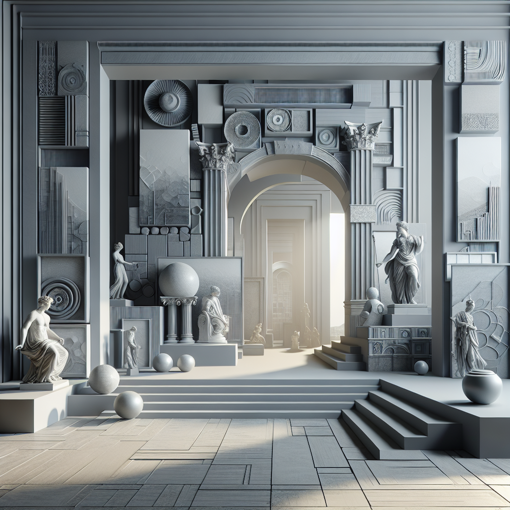
Gray Matters: The Importance of Gray in Art and Design

When we think of art and design, we often focus on the vibrant colors and bold shapes that make up a piece. However, one color that is often overlooked but plays a crucial role in creating depth and contrast is gray. Gray may seem like a dull and boring color, but in reality, it is a versatile and essential element in art and design.
Gray is a neutral color that can be used to balance out the other colors in a composition. It can act as a backdrop, allowing the brighter colors to pop and stand out. Gray can also be used to create a sense of harmony and unity in a piece, tying together different elements and creating a cohesive look.
In terms of design, gray is often used as a base color for typography and other graphic elements. Its neutral nature makes it easy to read and allows the other design elements to shine. Gray is also a popular choice for backgrounds in web design, as it is easy on the eyes and doesn’t distract from the content.
In art, gray can be used to create subtle shading and depth. It can be mixed with other colors to create a wide range of tones, from light and airy to dark and moody. Gray can also be used to create a sense of mystery and ambiguity, adding a layer of complexity to a piece.
One famous example of the importance of gray in art is the work of the renowned artist, Gerhard Richter. Richter is known for his abstract paintings that explore the relationship between color and light. In many of his pieces, gray plays a central role, creating a sense of ambiguity and depth that draws the viewer in.
In conclusion, gray may not be the most exciting color, but it is an essential element in art and design. Its neutral nature allows it to play a variety of roles, from balancing out other colors to creating depth and complexity. So next time you’re working on a piece of art or design, don’t forget about the importance of gray. It may just be the key to taking your work to the next level.

Leave a Reply